
Our own website, from 60 on a phone to 97
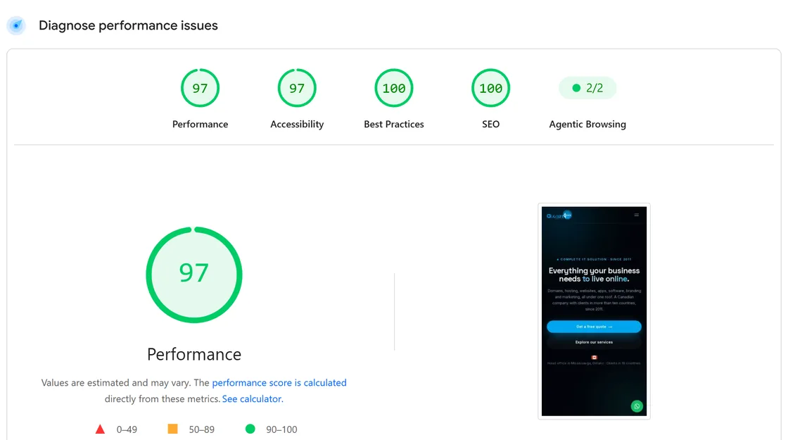
We tested our own site the way a client would, and on a phone it scored 60 and 75. The same evening it scored 97. What was slow and what changed.
The brief
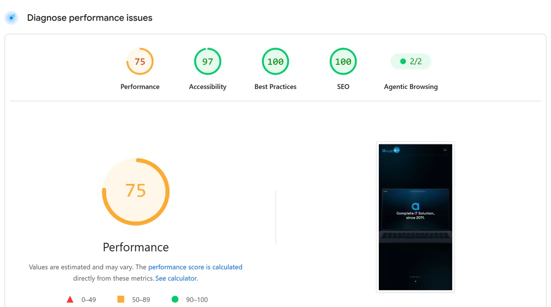
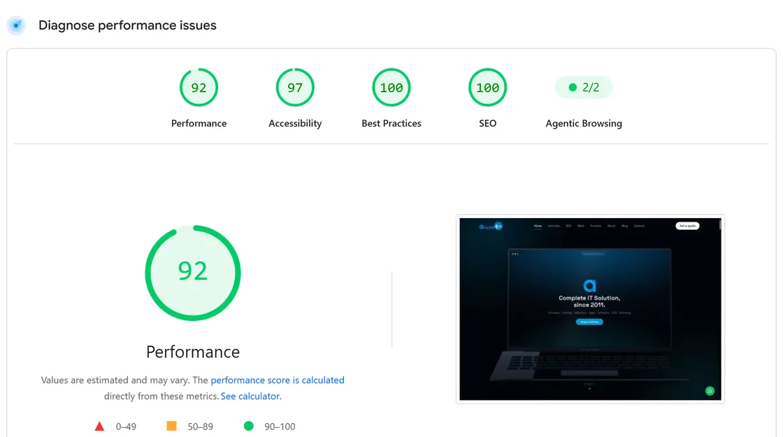
We sell website speed, so the first site anyone will test is ours. On 18 September 2026 we ran account4web.ca through Google PageSpeed Insights on mobile and it scored 75. A second run the same evening scored 60. Desktop was 92.
Neither number was a disaster, and both were wrong for a company that tells its clients a site should be fast on a phone. The brief was to fix it without throwing the design away, and to measure every step with the same tool a client would use.
What was actually slow
The home page opens with a laptop that unfolds and then zooms into the page. It is built with GSAP, and on a phone it ran while the page was still loading.
It also ran in an expensive way. The lid and the tilt were animated through CSS variables, and a variable changed on a parent is recalculated for everything inside it, so every frame restyled the screen, the logo and all sixty two keys of the keyboard. In a lab run emulating a mid range phone, the browser spent more than five seconds on style and layout while the page loaded, and most of it traced back to the animation.
Every heading on the inner pages waited for JavaScript before it appeared, because it used the same scroll reveal as everything further down. The page had painted, but its largest text was still invisible.
The fonts were never preloaded. The framework is meant to add that hint on its own and had quietly stopped, so the browser only discovered it needed the fonts after it had laid the page out.
Google Analytics loaded the moment the page became interactive, which is exactly when a phone is busiest.
What changed
Phones get the finished hero straight away: the heading, the introduction and the two buttons, drawn by CSS with no JavaScript involved. It is the layout reduced-motion visitors always had. The laptop still opens on tablets and desktops, and bringing it back on phones is a one word change.
GSAP now loads only on screens that use it, and only after the page is up. A phone never downloads it. The portfolio slider there became a native swipe, which suits a thumb better anyway.
On desktop the animation writes transforms straight onto the lid and the laptop, so each frame touches one element instead of everything inside it.
Page headings enter with a CSS animation that starts on the first frame, instead of waiting for a script. The 52 scroll reveals on the home page used to be 52 separate pieces of JavaScript; they are now one small script that watches all of them and starts while the page is still loading.
Both fonts are served from our own domain and preloaded, so they arrive alongside the stylesheet. Analytics starts on the visitor's first scroll or tap, or after ten seconds, whichever comes first.
What we did not do
We did not remove the animation, strip out analytics or cut content to chase a number. Desktop visitors see what they saw before, and phone visitors see the same content, sooner.
We also did not stop at the score. PageSpeed flagged two accessibility problems along the way: grey footer text a fraction too faint to pass, and a list marked up so that screen readers could not read it as a list. Both were fixed in the same release.
How far to trust these numbers
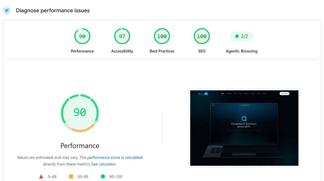
Lab scores move a few points from one run to the next, which is why both of the before runs are quoted and everything is dated. Desktop, which kept its animation, moved the most: 99 on the preview and 90 on the live site within the same hour.
After one more change, the desktop animation writing transforms instead of CSS variables, the next four desktop runs on the live site scored 81, 98, 98 and 99. The 81 ran at the same moment as two other tests; the three after it ran one at a time.
Google also reports how real visitors experience a site, but only once it has enough traffic, and account4web.ca does not have that data yet. When it does, it goes on this page, whatever it says.
Every item on this list is live on this site now.
Off phones entirely
- The laptop intro and zoom
- GSAP and its scroll plugin
- The pinned portfolio slider
Loaded later
- GSAP on tablets and desktops, after the page is up
- Google Analytics, on the first scroll or tap
Loaded sooner
- Both fonts, preloaded from our own domain
- Page headings, drawn by CSS on the first frame
- Every scroll reveal, watched by one script from the start
Fixed on the way
- Footer text contrast, from 4.48:1 to 4.75:1
- Service page lists, readable as lists again
- The desktop animation, one element per frame instead of dozens
60 and 75
Mobile score before, two runs
97
Mobile score after
4.2 s → 2.3 s
Largest Contentful Paint, mobile
3.3 s → 1.2 s
First Contentful Paint, mobile
The reports themselves, not a summary of them.
Have something like this in mind?
Tell us what it has to do. We will tell you what it takes to build, how long, and send a written quote before anything starts.